
Make the system
easy to follow.
A long page can say a lot and still leave a visitor unsure what to do next. Too many sites either overwhelm with everything at once, or hide the substance behind a single vague promise.
A multi-page editorial site that presents AI marketing systems, product modules and an audit-first engagement.
Visit Aureon One (opens in a new tab)Current status: Live public website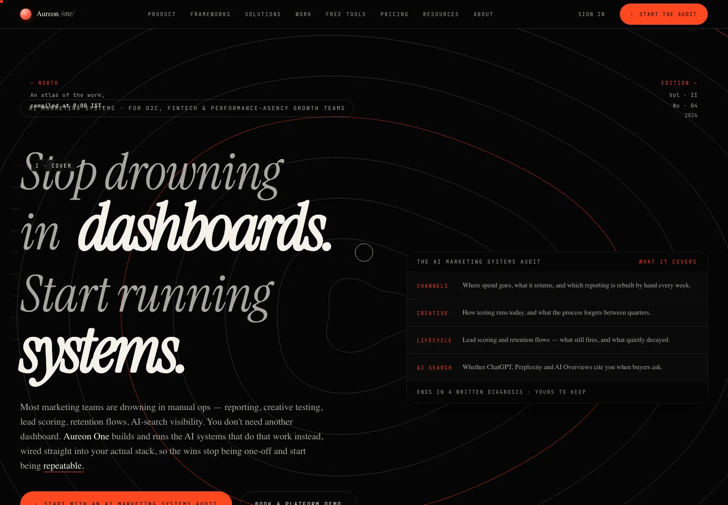
A specific job.
A deliberate shape.
Aureon One had a lot to say — five product modules, four kinds of marketing work, a full engagement model — and the risk was saying it all at once, to nobody in particular. The public homepage answers that with structure: a numbered folio that moves a visitor through an opening promise, the four jobs that fill a marketing week, the modules that handle them, and a system diagram, before it asks for anything.
What this means for youWhat Kinetivy would bring to a project like yours: positioning, editorial page design and implementation, built to carry a lot of substance without losing the reader.
Three choices
you could reuse.
- 01
Give a long page an order a visitor can feel.
Roman-numeral chapters, eyebrow labels and an edition masthead give the homepage a readable order, with a chapter marker that follows the visitor through it. If your business has more to say than a single hero and three cards can hold, this is the structure we reach for: a page that reads like a considered document, not a scroll of blocks.
For youA page structure built for how much you actually have to say, whether that is a single sharp offer or a full system worth walking through.
- 02
Name the reader’s problem before your solution.
The homepage opens with the four jobs that take up a marketing week — reporting, creative testing, lifecycle and AI search — before it introduces the modules that handle them. On your site, that means starting with the thing your visitor is actually dealing with, and only then showing what you built for it.
For youCopy that opens with the visitor’s problem, not your feature list, so the first line earns the second.
- 03
Say plainly what is ready and what is not.
Each module carries a live or beta tag, the engagement is described as audit, build and run, and the sample answer-engine panel is labelled as a sample report. Wherever your business is still finishing something, we design for that honesty directly, instead of dressing an early feature up as a finished one.
For youHonest status labelling for anything still in progress, so trust survives contact with the real product.
Read the build
through its evidence.
Read the folio
The public homepage presents nine numbered chapters, from the opening promise to a closing call to action.
Compare the modules
The product pages describe each module with its current status and feature tags.
Browse the free tools
A public directory lists marketing tools across content, SEO, social, email and advertising; the site states that no sign-up is needed.
The next build
could be yours.
Every decision on this page can be pointed at your business instead: your visitors, your data, your next release. Start with a free, editable Project Blueprint, kept in your browser. No email needed.
A good idea starts with a conversation.
Tell us the one thing you want to move forward. A short inquiry is enough to start.